Create a clear, designer-ready logo brief that captures your coaching brand and reduces revisions, based on proven brand briefing best practices.
Free PDF - professionally formatted, ready to print or fill digitally
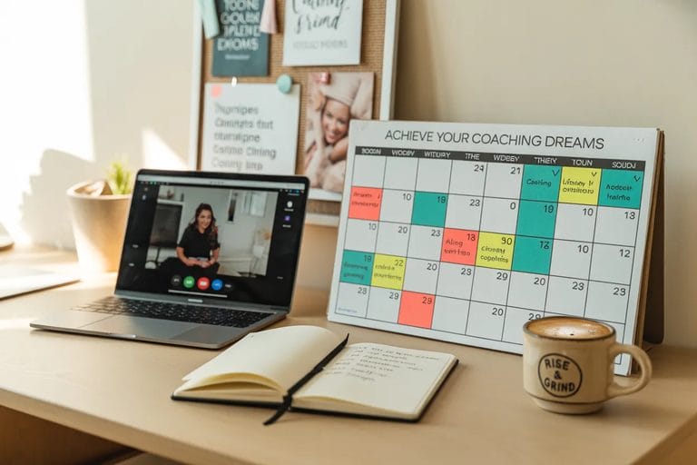
Download Free PDFA strong brief saves weeks of design revisions. Before working with a designer, this worksheet clarifies exactly what you want your logo to communicate.
A newly credentialed coach has worked with two designers and hated both results. The first logo 'looked like a spa'; the second 'looked like a therapist.' She's considering a third attempt but is afraid of wasting money again. When asked what she does want, she can describe what she doesn't want but can't name what she's looking for.
Frame the brief as protection, not just planning. 'You know what went wrong before - the designers built something that didn't fit because you couldn't tell them what fit looks like. This brief gives them your specifications before they start: colors, shapes, what the logo should make someone feel, and what it should not look like. A brief this specific eliminates the 'close but not right' loop.' Walk through each section with her before she completes it independently - the design alternatives boxes in particular often stop coaches who aren't visually trained.
Watch the 'feelings' section and the three design alternatives boxes for contradiction. A coach who writes 'warm, approachable, professional' in the feelings section and then marks a corporate sans-serif aesthetic in the alternatives boxes may not have resolved what she actually wants. Those contradictions are the coaching material - not a problem to fix, but a decision to make. Completing the logo checklist on page 2 first sometimes helps clients work backward to what the brief needs to say.
Start with the three design alternatives and ask her to describe each one as if briefing a designer verbally. The gap between what she wrote and what she can say aloud often reveals where she's still unclear. Then review the colors and HEX section: if she's listed colors without having tested them against competitors in her niche, do that now. A color that reads as 'professional and warm' in isolation may read as 'same as everyone else' in the context of her market.
If the client can complete the feelings section easily but consistently produces blank or vague responses in the colors and shapes sections, she may need visual reference work before the brief can be completed meaningfully - mood boards, screenshot collections of logos she responds to. Severity: low. Response: pause the brief and assign a 30-minute reference-gathering task before the next session. The brief is the output of visual thinking, not the starting point.
A coach six years into a successful practice has a logo she created herself when she launched - a stock icon with her name in a generic font. The logo no longer reflects her positioning, which has evolved significantly. She's starting to feel embarrassed sharing her website URL in professional settings. She has a budget for professional design work and is ready but doesn't know where to start.
Use the brief as a positioning clarification tool. 'Before we talk to designers, this exercise clarifies what your brand has become - not what you thought it was six years ago. The logo should reflect who you're positioning yourself for now, not who you were positioning for at launch.' The brand personality and voice section is particularly important for evolved practices: she likely has more refined language now about who she serves and how she's different.
Watch for tension between the logo she's embarrassed by and the logo she's afraid to commit to. Coaches with successful practices sometimes resist a strong visual identity because it feels like over-claiming - 'I don't want to look bigger than I am.' That resistance often shows up in the feelings section as an overly cautious set of descriptors (approachable, simple, clean) that don't match the confidence of her actual practice. The brief should reflect the practice she has, not the practice she started with.
Start with the logo checklist on page 2 and ask her to apply it to her current logo. Walking through the 14 functional requirements makes explicit exactly what's not working about the existing mark - which produces a clearer brief than asking her to describe the problem abstractly. Then ask: 'Which of these requirements, if met by the new logo, would make you comfortable sharing your URL in a room of senior executives?'
If the client completes a thorough brief but then says 'I'll probably just use whatever the designer comes up with,' the brief process has not resolved her underlying uncertainty about her positioning. Severity: low. Response: return to the brand personality section and ask directly: 'When someone sees your logo for the first time, what should they conclude about who you work with and what changes for them?' If she can't answer that, the brief isn't the tool to start with.
A coach has developed a proprietary framework and is preparing to launch it as a standalone product - a digital course, workbook series, or licensing program. The framework will need its own visual identity separate from her personal coaching brand. She's never briefed a designer before and is intimidated by the design conversation.
Frame the brief as translation work. 'You've spent years developing this methodology. The designer's job is to turn your intellectual work into a visual language. This brief is how you give them what they need to do that accurately. Without a brief this specific, they'll make visual decisions based on aesthetics; with it, they'll make decisions based on what you've actually built.' The three design alternatives boxes are particularly useful here: ask her to complete them as 'same as my personal brand,' 'extension of my personal brand,' and 'completely independent identity.'
Watch for the brief defaulting to her personal brand colors and aesthetic without examination. A methodology brand sometimes benefits from visual differentiation from the coach's personal brand - it signals that the framework is independent of any one practitioner. If she hasn't thought through whether the methodology brand should stand alone or nest within her personal brand, the brief will be inconsistent. That's a strategic decision, not a design one.
Start with the logo checklist on page 2 but apply it to the methodology's use cases specifically: where will this logo appear (course platform, workbook cover, certification badge, licensing materials) and which of the 14 functional requirements are most critical given those contexts. A methodology logo that will appear small on certification badges has different requirements than one that will appear primarily on a course landing page. The brief should be updated to reflect those context-specific requirements.
If the client is creating a methodology brand before the methodology itself is finalized - if the framework components are still evolving - the brand work is premature. Severity: low. Response: note that the brief she's building now will need revision as the methodology crystallizes, and suggest completing the brief for the framework as it currently exists, with the explicit plan to revisit it before commissioning the final design work.
A coach is building their brand and needs a visual reference document that captures colors, fonts, imagery direction, and tone in one place
Coach BusinessA coach who works without a defined methodology and wants to create one
Coach BusinessA coach is choosing brand colors and wants to understand what different colors communicate to potential clients