Choose brand colors with confidence using evidence-based color psychology to signal the right message and attract your ideal coaching clients.
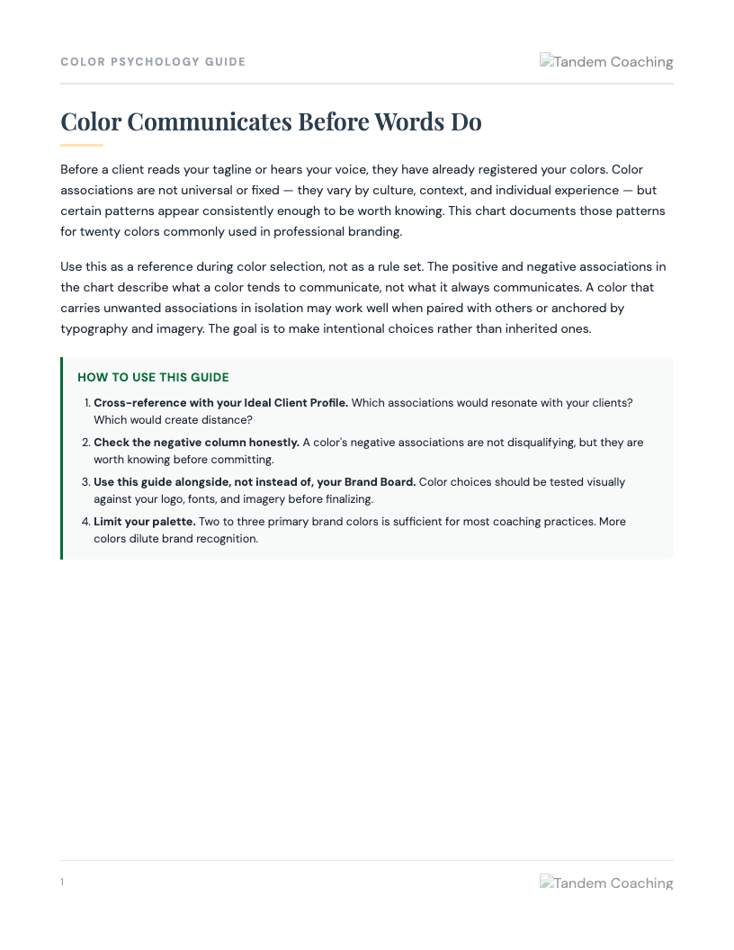
Color carries associations whether you intend them or not. This guide helps you make deliberate choices rather than defaulting to what you personally like.
A coach designing her first professional website has been choosing colors based on what she finds attractive - a soft blue she likes and a warm beige that feels calming to her. She hasn't considered what those colors signal to potential clients or whether they fit the positioning she wants.
Introduce the guide as a decision audit tool, not a design specification. 'The question isn't whether you like these colors - you do, and that matters. The question is whether what these colors communicate matches what you want clients to feel when they encounter your brand before they know anything else about you.' Walk through the positive and negative association columns for her current palette and then ask her to check those associations against the clients she is trying to reach.
Watch whether she gets pulled into the negative associations as disqualifying. The guide is explicit: negative associations are not veto conditions, they are awareness conditions. A color like purple - associated with creativity and wisdom but also immaturity and arrogance - may be entirely appropriate for her positioning depending on context. The work is to make the choice consciously, not to avoid everything with a negative column.
After reviewing the chart, ask her to name the one or two qualities she most wants potential clients to feel before they read a word of her copy. Then look at her palette: 'Which of those associations appear in the positive column for your current colors?' If there is a gap between the feeling she wants to create and what the chart shows, that's the decision point.
If the coach is in late-stage brand design and has already paid for a logo or website in colors she is now reconsidering, acknowledge the practical constraints before exploring the question. Severity: low. The guide is useful even after color decisions are made - it can help her understand how to use tone, saturation, and pairing to shift what an existing color communicates.
A coach targeting C-suite executives has a brand built around lavender and soft pink. She gets strong engagement from mid-career professionals but rarely converts executive-level inquiries. Several discovery calls have ended without a clear reason given.
Introduce color as one variable worth examining among several. 'We don't know for certain that the color palette is the issue, but it is worth looking at what those colors signal to someone evaluating whether to invest a significant amount in coaching.' Use the association chart to walk through lavender and pink - tender, caring, warm on the positive side; sluggish, childish, passive, trivial on the negative side. Ask: 'Are any of these negatives something an executive might be filtering for?'
Watch whether she is defensive about the palette because of personal attachment to it or because she has invested in it. Neither is a reason to avoid the conversation, but both are reasons to move carefully. The goal is not to tell her to redesign her brand - it is to give her a complete picture of what the color associations may be signaling so she can make an informed decision.
Ask her to describe the last two or three executive clients she did convert and ask whether they mentioned how they found her, what drew them to her, or what they noticed first. If multiple people mentioned referrals or content rather than first visual impression, color may be a lower-leverage issue than she thinks. If the pattern consistently points to a visual first impression as the filter, that's a different conversation.
If the coach has built an entire brand system - logo, website, materials - around the existing palette, a recommendation to change colors is a significant business decision, not a tool recommendation. Severity: moderate. This guide is most useful as a prompt for a strategic conversation about positioning, not as a standalone color fix. Surface the broader positioning question before suggesting brand redesign.
A coach who certified two years ago built her brand around dark green and gold when she was positioning for life coaching. She has since shifted to a more corporate executive coaching focus. The colors are not wrong, but they feel slightly off - and she has been asked twice whether she coaches in wellness or spirituality.
Use the guide to audit the current palette against the new positioning. 'Dark green - generosity, hope, growth - has strong overlap with both life coaching and executive coaching, so that one likely isn't causing the confusion. Let's look at what other elements might be reinforcing a wellness read: how the green is paired, what fonts and imagery it sits with, what associations the overall visual palette is creating together.' The chart is useful here for comparing what she has versus what would read more cleanly against an executive audience.
Watch whether she wants to change colors as a proxy for the harder work of repositioning her practice more completely. Color is visible and changeable - it can feel like action when the real work is audience and offer clarification. If she is being asked about wellness coaching, the color may be amplifying a positioning ambiguity that exists in her copy and offer as well. Ask: 'What do people who hire you for executive coaching say they saw first - your visual brand or your content?'
After reviewing the chart, ask her to name the one color in her current palette she is most certain fits the executive positioning she is building toward, and one she is least certain about. Start with the one she is least certain about and work through what swapping or adjusting it would require versus what it would solve.
If the positioning confusion is showing up in discovery calls, on the website, and in how she describes herself verbally, a color change will not resolve it. Severity: low. Name the scope of the issue clearly: color is one variable, and this guide helps audit that variable. If the problem is larger, it needs more than a palette review.
A coach trying to define a consistent voice across platforms
Coach BusinessA coach who posts inconsistently because they don't know what to write about
Coach BusinessA coach pasting the same bio across all platforms without adapting it