Getting to 85 – Agile Metrics with ActionableAgile Part 1
The topic of Agile Metrics frequently arises in various situations and discussions. Lately, I've been hiring Scrum Masters. One of my screening questions is, "What standard metrics would you track, if any, and for what purpose?" I've noticed that many candidates mention Velocity, Burndown, and Burnup charts, but very few can clearly explain their meaning and use. Another common interview question that trips up many candidates is Sprint length—if you want to know the full answer to that question, see this deep-dive on the optimal Sprint duration in Scrum and trade-offs of different time-box lengths.
So far, I've hired two Scrum Masters whose responses to this question did not include any of those metrics. What these two shared in common was their mention of, and ability to discuss, Cycle Time. Of course, this wasn't the sole reason they were hired, but it gave them an advantage over others. It's rare to hear Scrum practitioners bring up Cycle Time, Lead Time, Throughput, and Work Item Age, as these metrics were traditionally associated with the Kanban methodology. During the decades-long feud between Scrum and Kanban, these metrics were seemingly banished from the realm of Scrum and forgotten by many.
Entering PSK
It changed last year when Scrum.org partnered with Daniel Vacanti and others and developed the Professional Scrum with Kanban (PSK) course. I was lucky attend Dan’s course in Miami earlier this week. We were joking that the course was too heavy on math and numbers. It wasn’t. However, what was refreshing is to hear Dan passionately talking about numbers. Those numbers that matter, the Agile Metrics. Dan is a CEO of ActionableAgile - the home of a great suite of tools for Kanban practitioners. Dan graciously granted fellow Professional Scrum Trainers permission to use the software for educational purposes.
In the remainder of this post I will focus on the key features of the software and highlight how Scrum (and Kanban) practitioners can benefit from using it in their daily (or maybe weekly) routine.
Revving Up Our Agile Metrics Engines
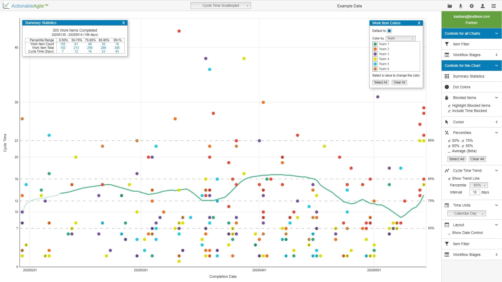
As you log in to ActionableAgile, you are greeted by what appears to be a chaotic Cycle Time Scatterplot. The software employs example data to demonstrate its capabilities—a nice touch. The scatterplot seems chaotic for a reason: it is. For each date (on the X-axis), it marks the Cycle Time (Y-axis) of all items completed that day. There is a comprehensive set of controls for the plot, allowing users to toggle Summary Statistics, color-code work items by various categories, display select percentiles and averages (more on this later), and show a trend line for a selected percentile cycle time. All these options, when enabled, are illustrated in the screenshot below.
I won't delve into every detail of the potential analyses you can perform with this data. However, the trend line is quite useful if you know how to utilize it effectively.
Agile Metrics – It Is All About Predictability
The heart of this plot is the percentiles that are calculated automatically; these form the core of Agile Metrics. By default, the software calculates the 50th, 70th, 85th, and 95th percentiles. There is no option to calculate a percentile value entered by the user, but I have never needed that option anyway. Why are percentiles so important? It's because they enable you to have meaningful conversations around the eternal question, "When will it be done?"
Build an 85th Percentile Story Stakeholders Trust
If your org keeps asking “When will it be done?”, we can help you translate percentiles into clear expectations and better flow decisions.
For example, the data loaded by the software shows that the 85th percentile stands at 16 days. This means that, all else being equal, a typical right-sized work item entering your system has an 85% probability of being completed in less than 16 days. Conversely, it also indicates that out of 100 items entering your system, about 15 will take more than 16 days to complete. Don't you think these numbers are crucial for your Product Owner and stakeholders? I certainly do.

Show Me the Money
Here's another interesting perspective on the data. Consider the cost to an organization to complete a work item. Assuming our teams are stable and we understand the full burdened cost of operation, we can associate a dollar amount with the probability of completing an item within that cost. However, exercise caution, as this is a ripe area for misusing the data. We're all aware of how team velocity was utilized and misused, despite numerous warnings from Agile practitioners.
There's a solid reason why PSK designates its service level expectations (SLE) as a team-level indicator and advises careful consideration before sharing it externally. This contrasts with the Kanban Method, which encourages transparency of these indicators. Moreover, they form the basis for discussions in Kanban meetings. That discussion, however, belongs in a different blog post.
When the conversation is focused correctly, the facts become clear to many. For instance, according to the data, reaching the 95th percentile in completion takes almost 50% more time (and thus costs 50% more) than the 85th percentile. It takes 16 days to reach the 85th percentile, and a significant seven days more to achieve an additional 10% on top of that.
With those numbers in hand, you can devise a strategy to attack waste. As we know from the very thorough Kanban Maturity Model, different levels of Kanban maturity address different types of waste. It all starts with Muri, or “busyness”. As we mature and incorporate more practices, we start addressing Mura, or “unevenness”. Only at higher levels, around the fit-for-purpose stage, do we begin to address the wastes usually mentioned by Lean practitioners, which reside under the Muda category.
The problem with many Kanban implementations (the incorrect ones, of course) is that people try to tackle Muda wastes first, while neglecting to stabilize the system first and bring enough predictability to it, letting individuals struggle with their busy daily routines. But I digress.
The Scrum framework at its core has mechanisms that deal with both Muri and Mura. It suffices to say that Mura is addressed by the mantra of “short-term stability vs. long-term flexibility.” The Scrum Sprint cadence provides a sufficient solution for eradicating Mura waste.
Returning to the discussion with stakeholders, we can examine the Muda factors that consume seven days to achieve another 10% more predictability and devise a plan on how to tackle those. For a practitioner-level treatment of dealing with difficult stakeholders in agile contexts, Roman Pichler’s workshop talk covers the dynamics that underlie these conversations.
In the second part of this review I will talk about 2 other hugely important and impactful charts – Cumulative Flow Diagram and Aging Work in Progress. The third part will be devoted to the Aging Work in Progress Chart and I will finish this series with a look at the forecasting using Monte Carlo simulation. If your team’s sprint commitment transparency is a concern, the information radiator gut check offers a daily confidence-tracking approach that makes sprint health visible at a glance.
Want “When Will It Be Done?” to Be Answerable?
In a free consult, map your current metrics (Velocity vs. Cycle Time) to an actionable predictability approach your teams can sustain.
Book a Free Consultation →


